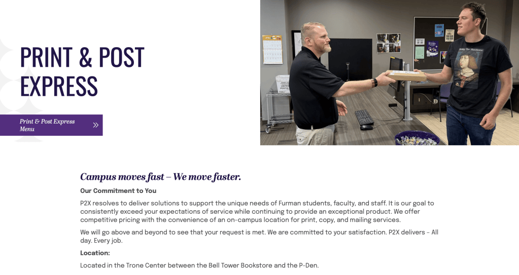
During my time in grad school, I worked as a website editor for Furman University. Furman uses a complicated WordPress-based website builder. The idea behind it is that no matter who at Furman needs a webpage, it will always be formatted and branded properly, without the person building it having to tackle the intricacies of university branding.
An institution as large as a university requires an enormous variety of websites, web tools, and other online resources. Each one serves its own specific purpose while also needing to remain a recognizable part of Furman University’s brand identity.
Unfortunately, as hinted at in The Elements of User Experience, trying to accomplish this much within a single, confined design identity inevitably invites UX disaster. As someone who regularly works on Furman’s websites, the biggest challenge I face is trying to get important site features to both look good and function clearly and properly within the constraints of Furman’s web design system.
Take the P2X site, for example. As Furman’s official print and post office, P2X needs a website with very specific features to help students order prints and send mail. However, Furman’s official web design constraints, which are designed primarily for copy-heavy academic sites, are a terrible fit for a website intended to help students shop and place orders.
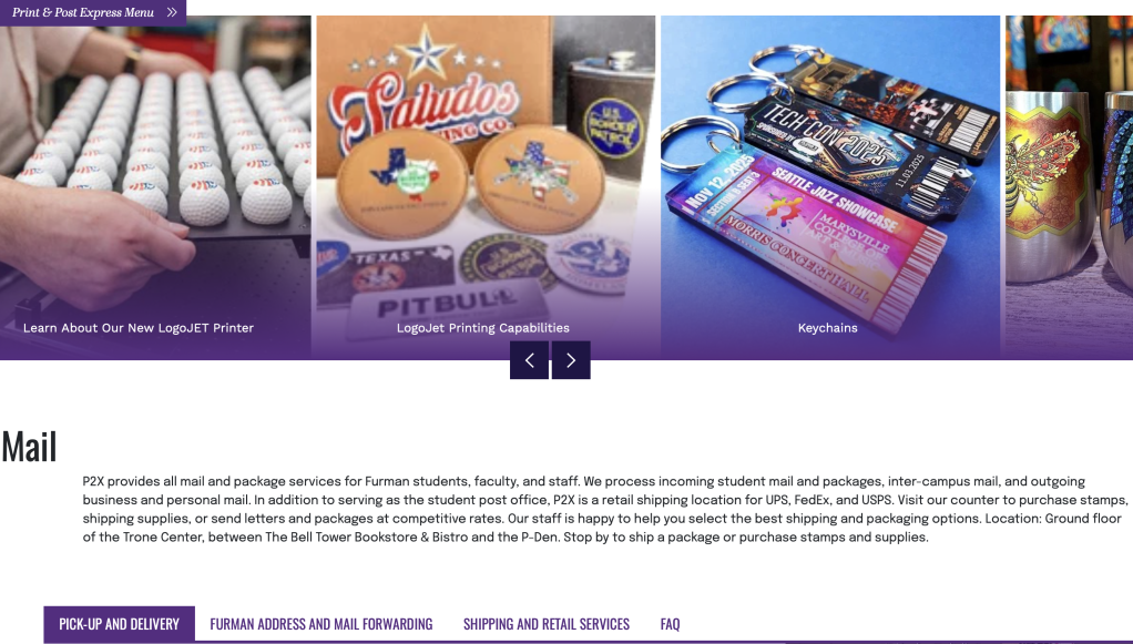
When I was tasked with redesigning the P2X website, the principal challenge was not figuring out how to make the site better, but rather how to make the needs of P2X fit within the strained constraints of Furman’s website builder. It was a significant challenge because intuitive features that would otherwise make perfect sense for the website either had to be left out entirely or made considerably more complicated to accommodate Furman’s design restrictions.
My takeaway from this frustrating experience was, firstly, that not every website can fit into the same mold. Websites are like their own ecosystems, each with specific needs that allow them to flourish and thrive. Trying to force one of these ecosystems into an environment that wasn’t designed for it can be detrimental to its functionality.
Furman is now looking to spin off the mail site onto an independent website host. Yes, it will be more work to build a website for Furman from the ground up, but that work will be well worth the effort. It’s much better to have a usable and useful mail website than an unusable one that looks purple.


Leave a Reply